I am currently employed under GN Hearing as a senior UX designer. I have also 8 years of professional experience in 3 of the leading design agencies in Denmark.
Curently I am focusing on integrating the creative digital process into a large organization. I have been experimenting with various different design methods and approaches. I believe this makes me a fluid learner in a fast-pacing and creative industry. Besides my flexibility, I always stay true and passionate about what I do, that is to ensure the final design solutions are both aesthetically appealing and highly implementable from the moment the idea is conceived.
As both a creative rooted and digital-born mind, my digital competencies reach all the way from concept and idea development to the end implementation. To stay current and relevant I thrive to navigate through the latest international design trends. In the heart, It is both satisfying and comfortable to share my success and mistakes with my colleagues. I fundamentally believe that teamwork and a collective effort is what gives us an advantage in a competitive world.
Senior Digital Designer
2019 - current
Senior Digital Art Director
2017 - current
Digital Designer
2012 - 2017
Junior Digital Designer
2010 - 2012
As an experienced digital designer, I am practicing my design tools every day
Jack of all trades, master of all tools. I believe both the logic and the emotions are what make design solution alive. So I build my design solutions as production-ready as possible.
Master Of Arts(M.A.)
2008 - 2010
Bachelor
2005 - 2008
As a designer, we are always collecting different methods, tools, and materials to build a system that serves our design goal. A system by its definition can be “a set of things working together as parts of a mechanism or an interconnecting network; a complex whole.” If we looked at interface design as a system, we can break it down to the basic graphic elements, that will be: 1. Space 2. Text 3. Colour 4. Shape 5. Motions
All these elements have their own properties, and by experimenting, categorizing and interacting with their properties, we are essentially making rules for these elements. The defined space turns into layout; The variant set of texts become typography; the random colors becomes color palette; the different shapes form icons, illustrations, and interface elements; A sequence of motions become meaningful transitions. By collecting and combining all these efforts together, an inspiring “interface examples/template” is born. But they are not a “system” yet, a system needs to be alive and must be greater than the sum of its parts. Only exhibiting how single element works in one condition/example some time can not speak for its true quality. A lot of projects stop at being inspiring examples, but it never progresses to be a live system. More and more companies are striving to create a live interface design system, because they can better discover the true quality of an element, and govern the future changes.
A live interface design system always starts with collection of different graphic elements, As an interface designer, we need to understand their properties by experimenting our collections in different conditions. But an authentic design system not only relying on the quality of its “graphic elements”, but heavily depends on the interaction and testing between the “graphic elements”; once you change a single size of certain typography settings, you should be able to see the effects across the system and evaluate the values the change brought and then implement to the examples. This collect -> experiment -> understand -> test -> evaluate -> implement
cycle eventually become my driven force to create live interface design system.
The design is a part of the business, we are always exploring different tools in order to increase our creativity and productivity. A live design system is not new in the graphic design world, we used different tools to govern our systems, from the InDesign to Photoshop to Illustrator/fireworks. But with the growing complexity of interface design, more and more tools have been invented. And after entering 2015, there is a boom of different tools for this purpose. Some are tailer towards collaborative workflow, like Figma; some are tailer towards motion design, such as Principle and Framer. After trying several tools, I decide to invest myself more and more on Sketch App. I hope I can explain why I do so on the rest of this blog.
It is always difficult to compare a tool to another, nevertheless judge which one is better. Because tools are made to accompany different tasks, so it is important to have a clear task in this case. The goal of today’s interface design already moved beyond static page type, an interface designer today should anticipate how his/her design envolves/changes in a dynamic team environment because it will. The nature of uncertainty in today’s design sprint and agile development methodology encourages changes. So a lot of work the designer does today is to make the possibilities for the entire team to decide later. So how to achieve that on the daily basis? In my experience, the interface designer should try to avoid copy and paste, literally. If you find yourself build up your design system by copying the pages and elements again and again, then you probably will soon be drowned by your own work. This is because everytime you copied and pasted, you lost more control on managing and governing your own design direction. To avoid this, you can think what common properties your graphic elements have, and try to think what design qualities these properties will bring. Then you can populate your design examples and maintain the relations between elements, properties, and its usage.
Sketch do support some of the logic and the whole “system cycle”. The Text styles
and Shared styles
support how designer can change the Text, Colour and Styles onto the entire system, this helps designers evaluating how changes should be implemented to the examples; the Symbols
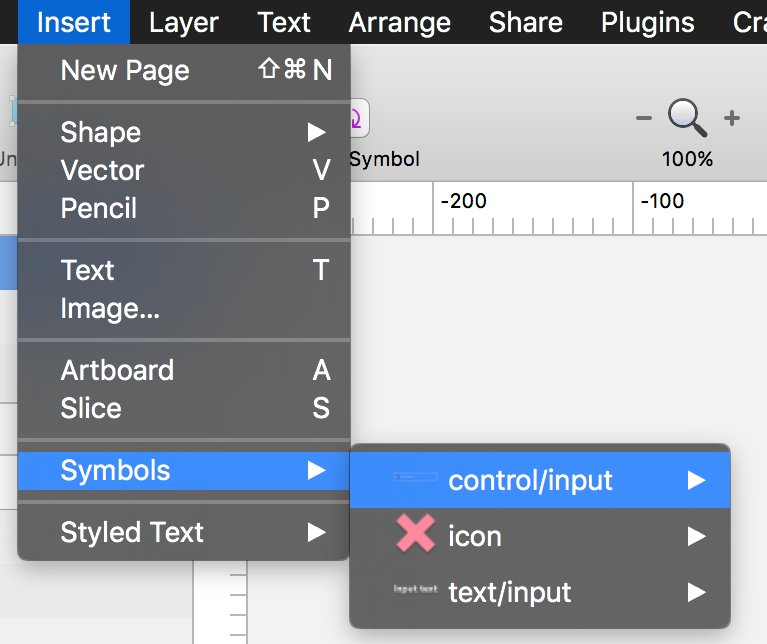
supports designer to isolate different shapes and interface elements, to test them in their different conditions; the introduction of nested symbols
further extend the possibilities for designer to swap and combine different interface elements, so you can have an entire interaction flow, but only one unique place to govern and change them all. The sketch also introduce the basic motion to their Prototyping
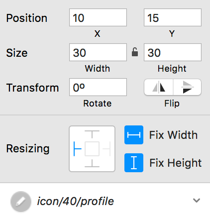
mode, it is not so refined, but it is sufficient at a certain stage of the design. At the moment the sketch has the Resizing
option to support how element space
should be defined in design, and the plugin from anima further refine the resizing
option by supporting pin element by certain pixel or percentage. There are definitely some areas sketch are missing if you compare it to Illustrator or Photoshop, but I believe that sketch has taken a deeper look into what a Live Interface Design System needs today, and by providing a more essential and leaner workflow it ultimately encourages designer to embrace the uncertainty and be more creative.
So, as you have read so far, you know that I am for sketch App, at least for now. Instead of trying to make a benefits list, I think it is best to show it in a simple case.
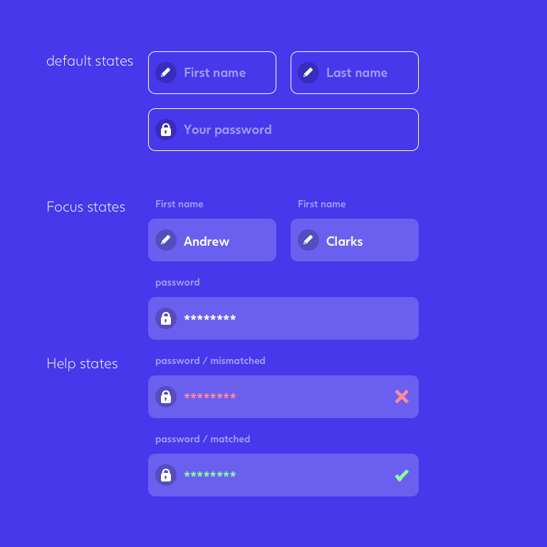
I have taken a small case on how you can build on the sketch app unique features to make an input form design.
The design show how input manifest itself in a visual form. It has different icons, different states and visual assist on what help states are(password matched or not).
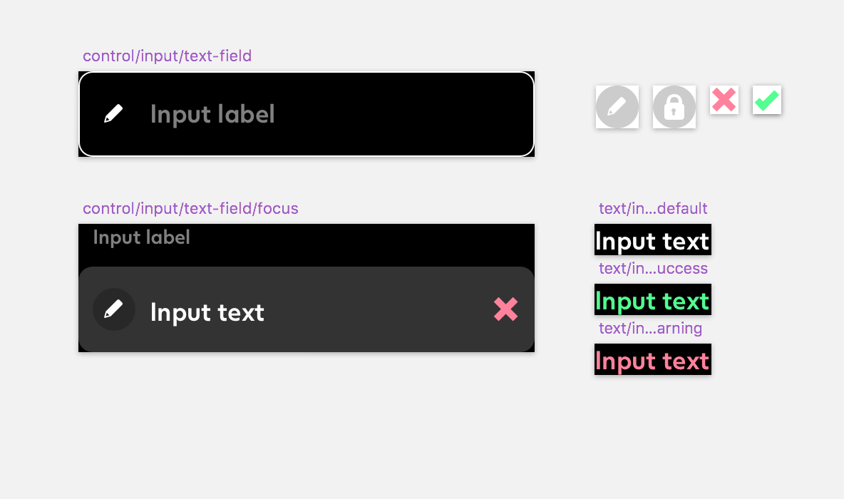
The design example above starts from a blanket canvas, but to understand the properties of the elements I quickly moved to symbols; and expand my design from here. From here the relations of the elements and its properties are much more clear, you can see how many states you are creating and need to create; you can understand how big and detailed the icon should be; you can also see exactly how the color palette is affecting the final design. All this will assist you to make more rational decisions toward the uncertain future; decision made in this manner will help you to translate your design to different team members and accelerate the product development
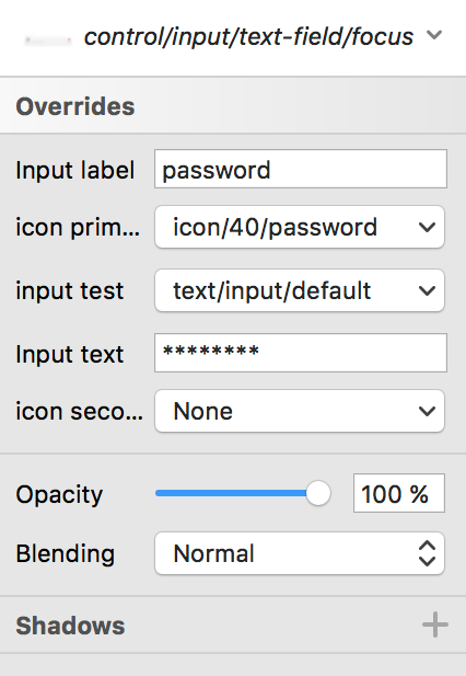
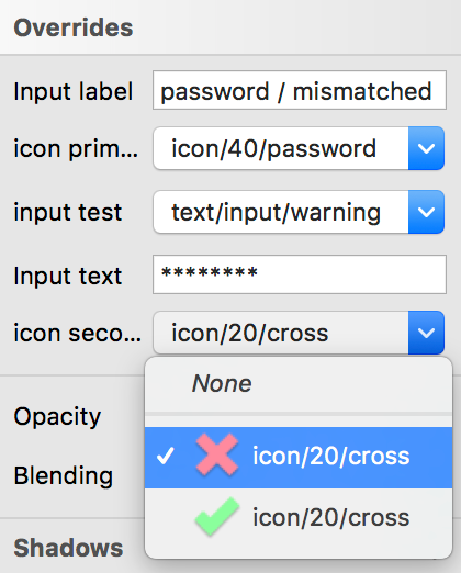
A symbol in skech design provides the possibility to override its original content. By inherit the element design properties, you are not copyingn elements, you are just applying your design logic to the content.
The nested symbol further provides you the possibility to manage and govern the hierarchy and logic behind your design elements. You can also use this as placeholder for your creativity, so you can progress your design system faster, but during this progression, you can continuously test to see how your symbols hold up to the real-life challenges.
The resizing option allows you to design element in different sizes. This further enhence the ability to manage and inherit the important design property to symbols.
By naming your symbols as elements/element--states, or element-group/elements, or a mix of both, the sketch App helps you to organize your symbols in a tree-like structure.
I hope I have shed some light on the mechanism behind modular layers in Sketch App. This mechanism is not made by coincidence, it is a help for a designer to transfer uncertain future into the certain frameworks, and hopefully, it will improve both your productivity and creativity. For example, at the early stage of the project, no one is certain about how the submit flow works, but we all know what View controllers UI take to build a submit flow. All the graphic elements are predefined, but someone needs to collect the pieces and exam their qualities. By breaking the bigger flow into smaller symbols
, text styles
and shared styles
in sketch App, the digital designer becomes the visual translator between uncertainty and certainty; the digital designer becomes the visual navigator for the teams to build the future product.
The deep tie-in between Sketch Tool and Interface Design System nature are not guaranteed for faster design cycle, but it at least provides a better and leaner workflow for digital designers to explore.