Before we start the subject matter
The following post will not focus on how design system looks like nor what kind of product it is. I will cover them in the next posts. This post will primarily focus on *how to use design thinking and creative toolset to maximize the design impact in a Dual Track Design Sprint with limited design time investment.*
The design process optimization is a never-ending topic in the digital creative industry. Everyone is more or less convinced that a “healthier” design process increases the quality of the final result. Besides the better result, a healthier process will also encourage knowledge-sharing and transparency during the project. Personally, I feel also better when there is good dynamic in the project. During the last 3 months, I have been lucky enough to work with a talented team on a digital product. The core design part is accomplished in a 6 weeks’ Dual Track Design Sprint, it is a very valuable learning process, and I would like to share it in the next few posts. There are many have experimented with and documented how an ideal design process should/could be, this means it is not going to be an entirely new story. In reality, every case is different, I will try my best to share my experience and learnings here.
Background
Goal
The project objective is simple: in the age of streaming, the traditional broadcast companies is heavily challenged by the new streaming platforms. Younger generations prefer to binge through a new Netflix release within few days. We are still couch potatoes. But how can a transitional broadcast company bundle their content and service to survive this shift?
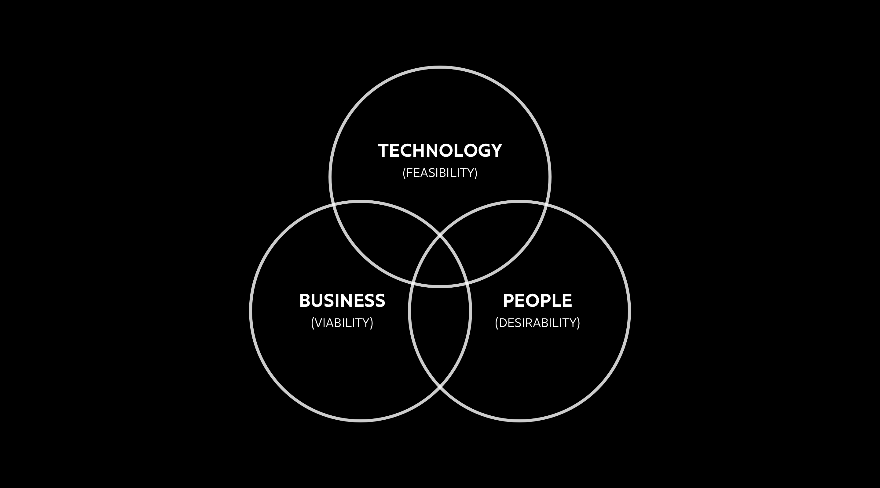
It is a classical design question, how to leverage the feasible technology in order to move the stakeholder to new viable business model.
The main goal for the design team is to create a successful cross-platform digital product to stream the video content.
The Team and our belief
The Core Design Team is a 9 man/women’s team:
1. 1 UX lead
2. 1 UX designer
3. 1 Digital Designer(Me)
4. 3 Developers for ios, android, web
5. 1 scrum master
6. 1 project manager
7. 1 advisor
We also partner up with another technology provider to provide us the technology dependencies in order to get the product up and running. It is not a big team, but before the project started, we were/are still believing that the design is much needed in this project because we aim to deliver a product that differentiates itself from the competitors. The technology is already proven as a video stream platform; the Business Ops is already running a working product. The main challenge we focus on is how to build pathways among technology, business, and the design, so from a holistic point of view, we can generate value both for business and the user.

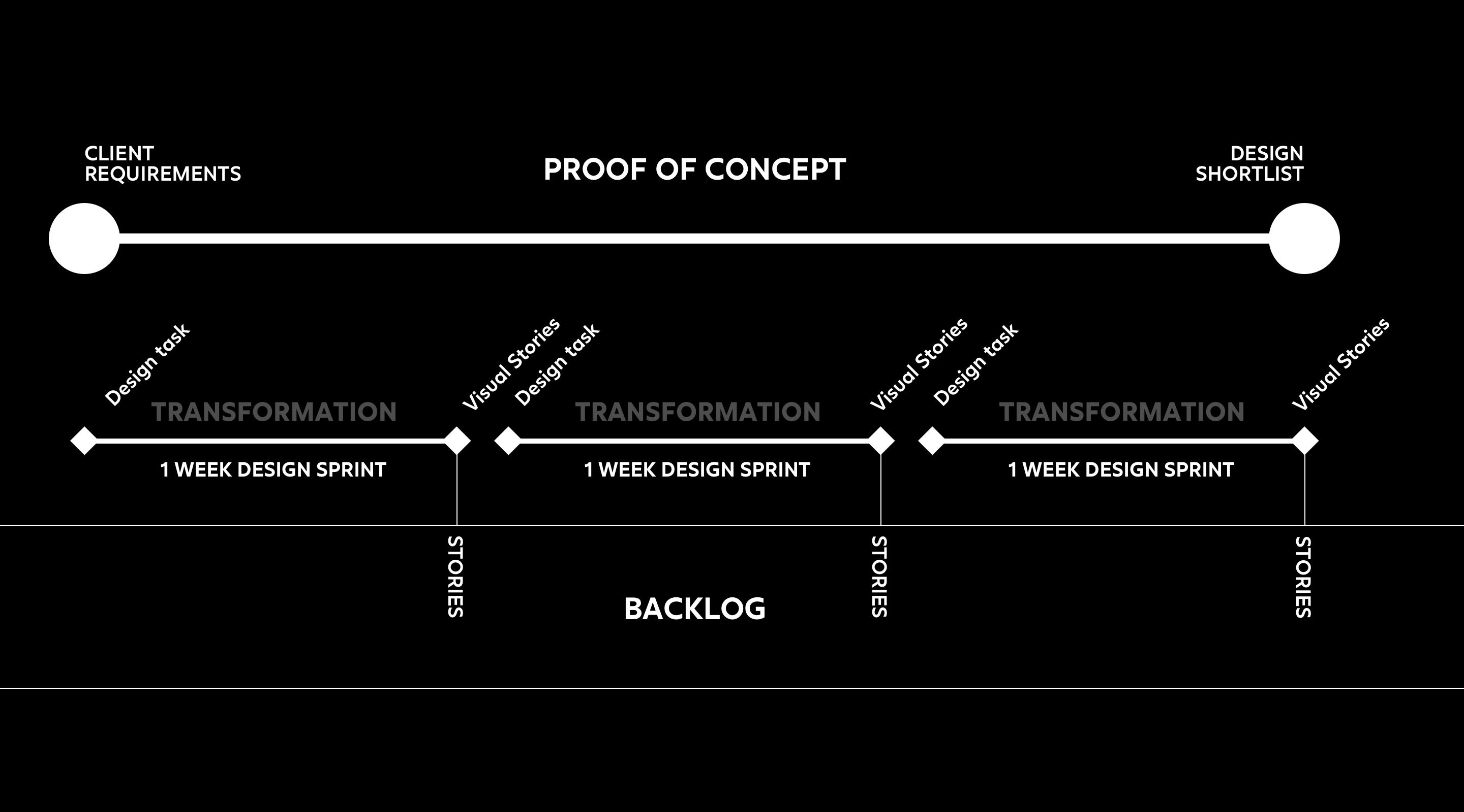
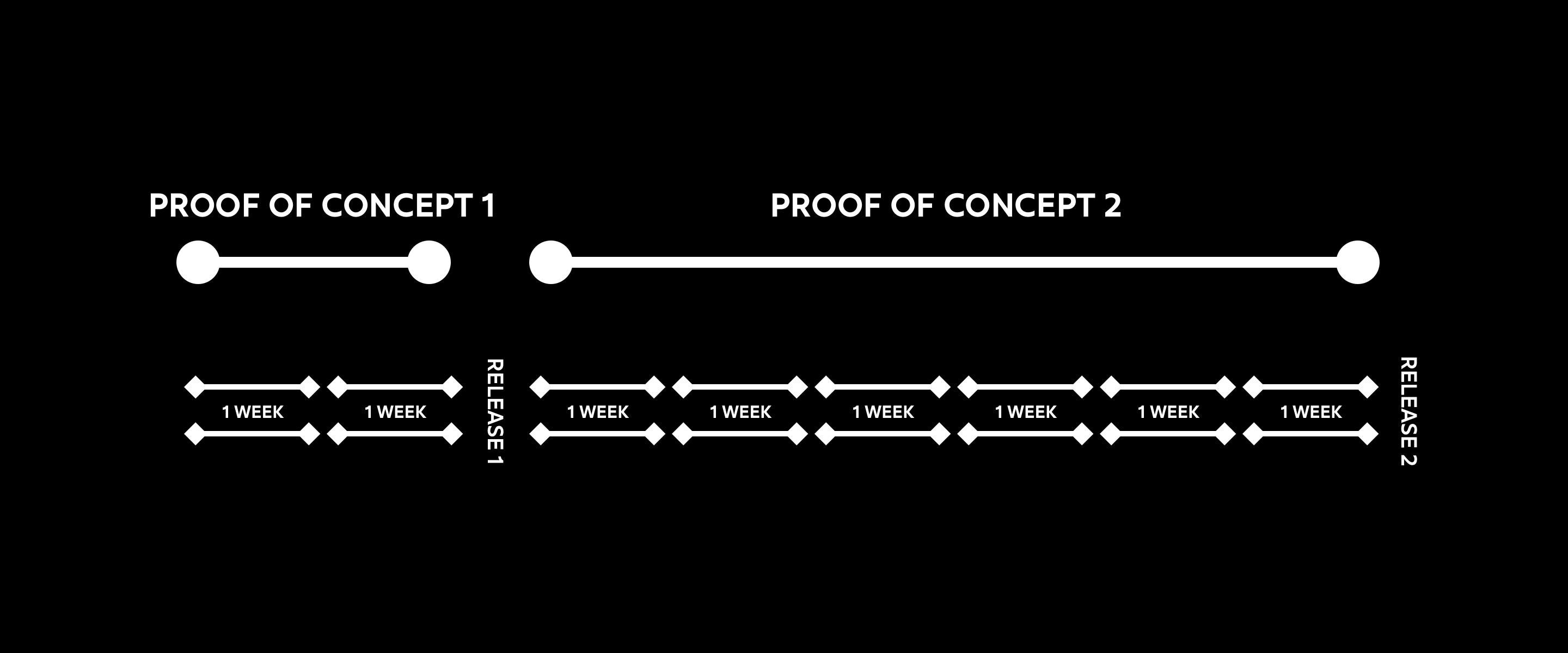
In order to reach the goal without blowing the budget, we decided to drive the project by the idea of “Proof Of Concept”. There are in all 3 POCs and a final Commercial Launch phase. The releases reach will grow from 10 people to their current user base.
Before we start the POC phase, the core design team had few days for sprint planning. For design perspective, the sprint planning translate client requests to arrays of design tasks. This process has been captured in an Excel file, it is not the most ideal format, but it works fine for the core design team. We later move this to the google drive for better transparency. For each sprint under different POC phase, we paired them with a list of different design tasks from the design shortlist. This, of course, will have a huge impact on the direction of the project, while we learn more about the project, the Design Shortlist will also grow and change with it.
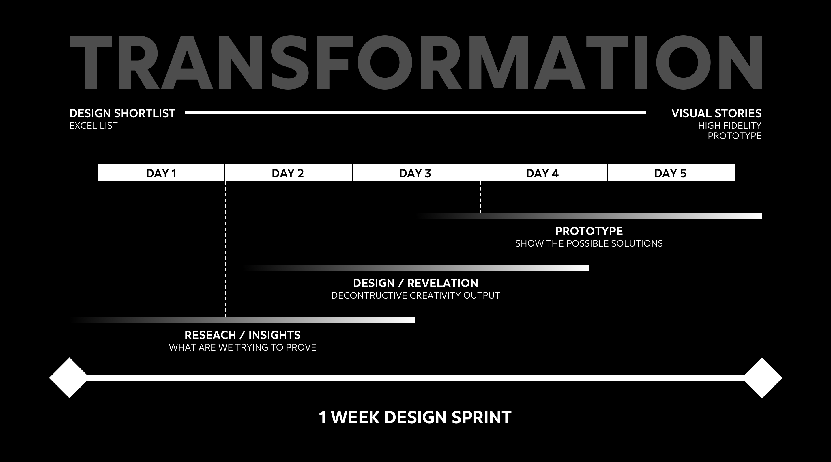
There are 3 main objectives for this process.
- Understanding the challenge and experiences from a holistic point of view, making hypothesis
- Learn from the understanding/insights, and deconstruct the learnings to design sketches.
- Show your design sketches in a high fidelity prototype format.
This planning allows the core design team focuses on flows and users more than the features.

Learnings from using Design Shortlist as a communication tool
It is vital for the client to understand why we practice this Requirements to Design Shortlist transformation. It is important to remind the client that "your xxx from the requirements can be found here in the latest release", but it is more often, and even more important to show the client that, we have resolved their requirements in more than one sprints, or we have already merge multiple requirements into one design tasks. It is not always possible to map the requirements to a single design task from the beginning, but the Design Shortlist is a process, not a tool. It is a process to validate and initiate a creative process. The Design Shortlist becomes a very welcoming tool as a communication tool with the clients if both parts have a full overview of the original requirements.
Time Frame
In each POC phase, there will be several Dual Track Design Sprint. It might be excessive for the first POC to run dual track since it is only 2 weeks, but it offered a soft boarding process for everyone. So in the rest of the post, I will mainly discuss how we run the 2nd POC, which holds most sprints so far in this project. The 2nd POC last for 8 weeks, in between people have taken holidays, so we had all in all 6 weeks to complete 6 one week dual track sprint.

The Dual Track Model
As a designer, and from the design-driven project, the essence of the Dual Track practice is to propel the project by looping validated design between development and testing. The week has been divided into roughly 3 parts, Input, Creative thinking, Output. To weave this 3 parts together, we also have a daily stand-up cross the team and stakeholder, 2 times Refinement sessions to assess and arrange the development.
We will go depth into a designer’s week, but I will also try to explain how we divide the week this way, and what goes into it.
This is provided by the start of the week. We will have a demo day on Monday, normally it will last for one hour, sometimes longer. We expect to receive the feedback at the end of the day, although realistically we should also expect to get most of the comments on the second day. It is important to point out that not all input will have a direct impact on the final output, they will also be evaluated by the core design team before the designer takes action on it. On the first sprint, instead of demo day, it normally will be replaced by a kick-off meeting; on the last sprint, instead of demo day, it is preferred to hold a showcase presentation.
Format & method: Demoday remote meeting by skype and screen share, the feedbacks and comments are documented in a wiki page.
2. Creative thinking
This is the backbone of the week. During Tuesday and Wednesday, the core design team will gather into the war room, looking at the Design shortlist; sketching on paper; taking inspirations from the existing product; interviewing relevant experts in the fields. It is a 2 full days’ process, preferably 10-15 hours of creative process. So basically, most of the creative practices are done here, which also means a lot of the important design decisions were also done here.
Format & method: Classic design thinking methods, including sketching, brainstorm, interview etc. The idea is documented as pictures and shared on Dropbox and Slack Channels.
3. Output
At the last part of the week, this is when digital designers go to work. At the end of the week, the team will produce the design ready in high fidelity level, so on the next Monday, the design is ready to be shipped to the client and the development team. The process will take 15-20 hours.
Format: Invision prototype
4. Daily stand-ups and refinement sessions
I have grouped this two activities together because they both serve as alignment purpose across the team. Most of the time, the scrum master will lead the assessment and the discussion. However, I also found it is important for the designer or the UX lead to participate in the refinement session as the support role. This is because , not all design ideas/concepts are explicit enough for the scrum master to carry out to the team. It provides the project with a lot of tractions when we document every design concept and decisions by dividing them into smaller parts(as user stories and acceptance criteria). Especially with the fast-moving development, it is more important for everyone to communicate their thoughts on user acceptance criteria thoroughly.
Learning from the Dual Track Model as designer
- Feedback will not always land on time, be prepared to be agile during the week.
- It is really about comfortable with being uncomfortable. The traditional waterfall process allows designers to process a longer solitary time, the design will be released only when an artboard is perfect, or close to perfect. But in the Dual Track Model, it is most encouraging to share the ideas and designs, especially when they are not 100% ready, so everyone can help to move further. This will by default require everyone have an open mind when making decisions based on users, business, and technology perspectives.
- Some of you might already notice that we are missing the user-testing in this model. And yes, it is also another learning, that we should include user-testing early in order to fail fast. But due to the current team capacity and client request, we have to wait until the beta release build.
The practices
We already have talked essential parts for the Dual Track Design Sprint. It is a lot of moving parts, therefore it is critical for a designer to arrange their week in an agile manner, so we are always ready for receive input and produce tangible solutions in shorter loops. This is normally how my days are in the sprint.
Monday
| 09:00-10:30 | 11-11:30 | 12:00 - 12:30 | 12:30 - 17:00
| ———– | ———| ————–| ————-
| Demostration remotely with Client | Comments assessment | Break/Lunch | React on Comments if needed
Tuesday
| 09:00-9:30 | 09:30-12:00 | 12:00 - 12:30 | 12:30 - 17:00
| ———- | ———| ————–| ————-
| Team gathering and planning on Design Shortlist | Creating and sketching | Lunch | Interviewing experts if possible, receiving and reacting on Design feedbacks from last days demo.
Wednesday
| 09:00-12:00 | 12:00 - 12:30 | 12:30 - 14:30 | 14:30 - 15:30 | 15:30 - 17:00
| ———– | ————- | ————–| ————- | ————-
| Creating and sketching | Lunch | Creating and sketching | Refinement | Creating and sketching
Thursday
| 09:00-09:30 | 09:30 - 12:30 | 12:30 - 13:00 | 13:00 - 17:00
| ———– | ————- | ————–| ————-
| Prepare sketch files | Creating high fidelity prototype | Lunch | Creating high fidelity prototype with one tea break
Friday
| 09:00-09:30 | 09:30 - 12:30 | 12:30 - 13:00 | 13:00 - 15:00 | 15:00 - 16:00
| ———– | ————- | ————–| ————- | ————-
| Prepare sketch files | Creating high fidelity prototype | Lunch | Creating high fidelity prototype | Prepare the next demostration with the Core Design Team

As I already mentioned above, the designer’s week in the Dual Track Design Sprint does not have as many production hours compared with the Waterfall Model. The challenge lies in the constant communication will most definitely drain your creative hours quickly. You can also see that in all, I might get away with 15-20 hours of design production time for the high fidelity prototype, the extra hours often come on a monday afternoon. I try to arrange this design production time in longer sessions with smaller breaks. So it will be easier for me to dive deeper into the solutions. This means actually 2 things, one is practicality, the other is the mentality.
1. For practicality, as a designer, you should be quick with your tools on creating the high fidelity prototype. It doesn’t matter which tool you choose, as long as it is both fast and can produce high fidelity and sharable prototype.
2. Use the rest of the time wisely, your 15-20 hours of creative production is build on the rest of the hours of the week. These hours are your gateway to the clients, developers and other important stakeholders. Talk with your core teams on your idea, share how you imagine your design looks like in low-resolution format(again, gaining speed).
Learning on the limited Design Production Time
- Speed is great, but high fidelity create value for both clients and developers.
- You are capable to use less time to achieve more.
- Sometimes the intensity of your workload will increase, but always prioritize, so to prevent potential show stopers.
In the next post, I will also try to share how I arrange my design structures, so it is easier for me as a designer to cope with this fast-pacing design requirement.

